
Building a chart in Excel isn’t hard, but getting one to look clean and tell the right story can eat up an afternoon. An Excel chart template skips the formatting fight: the chart is already built, so you just replace the sample numbers with your own.
This page has 18 free Excel chart templates for business, projects and everyday tracking, including candlestick, waterfall, pie, Pareto, run and line charts, an organization chart, timelines, a chore chart and health trackers.
Which Chart Fits Your Data?
| You want to show… | Try this chart |
|---|---|
| Trends over time | Line chart or run chart |
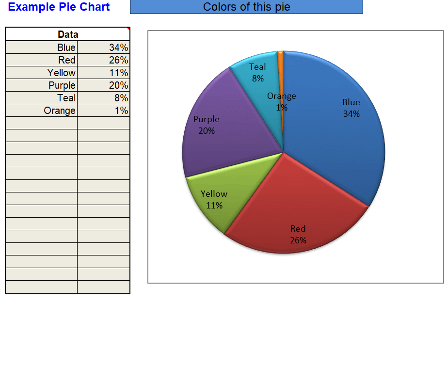
| Parts of a whole | Pie chart |
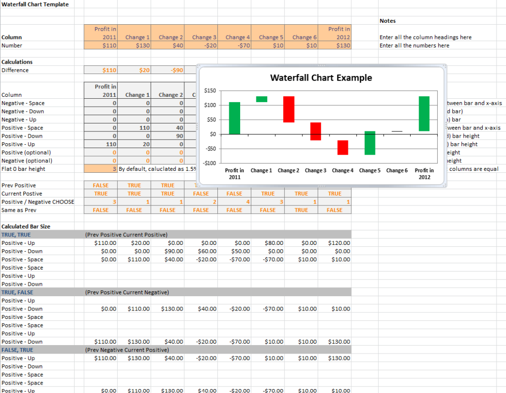
| How a starting value rises and falls to a final total | Waterfall chart |
| Which few causes create most of the problems | Pareto chart |
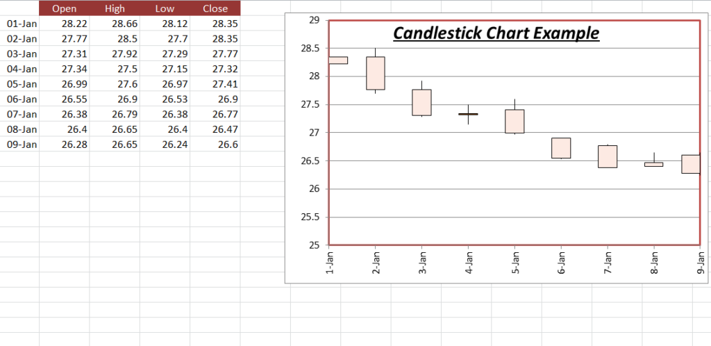
| Price movement (open, high, low, close) | Candlestick chart |
| Project phases and deadlines | Timeline chart |
Free Excel Chart Templates
Candlestick Excel Chart Example
Sample Waterfall Chart Template
Example Pie Chart Template Excel
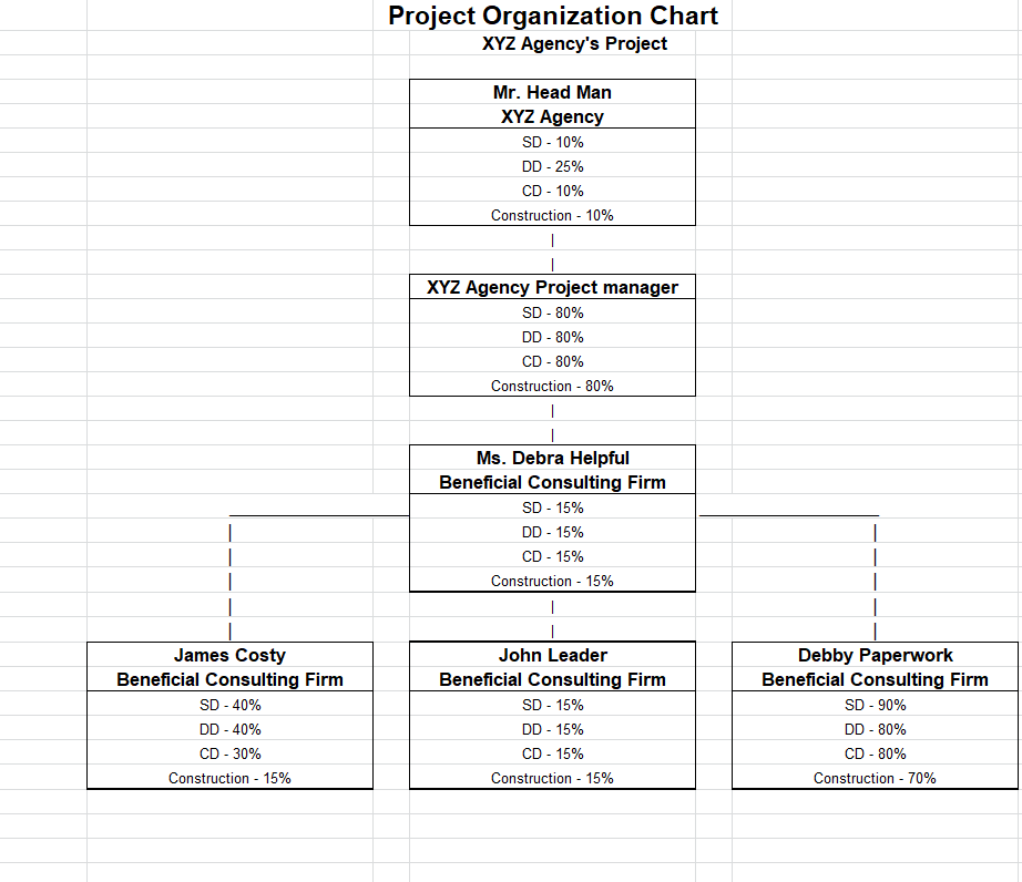
Project Organization Chart Template
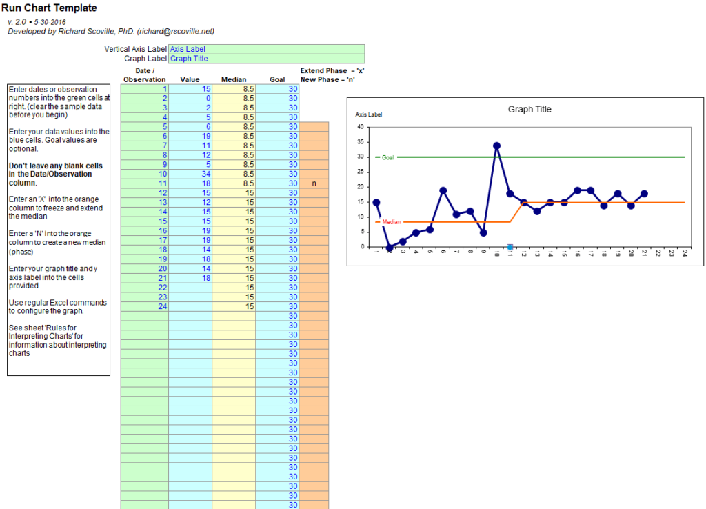
Excel Run Chart Template
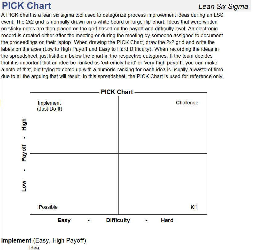
Simple Pick Chart Template in XLSX Format
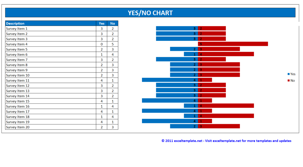
Basic Yes/No Chart Template
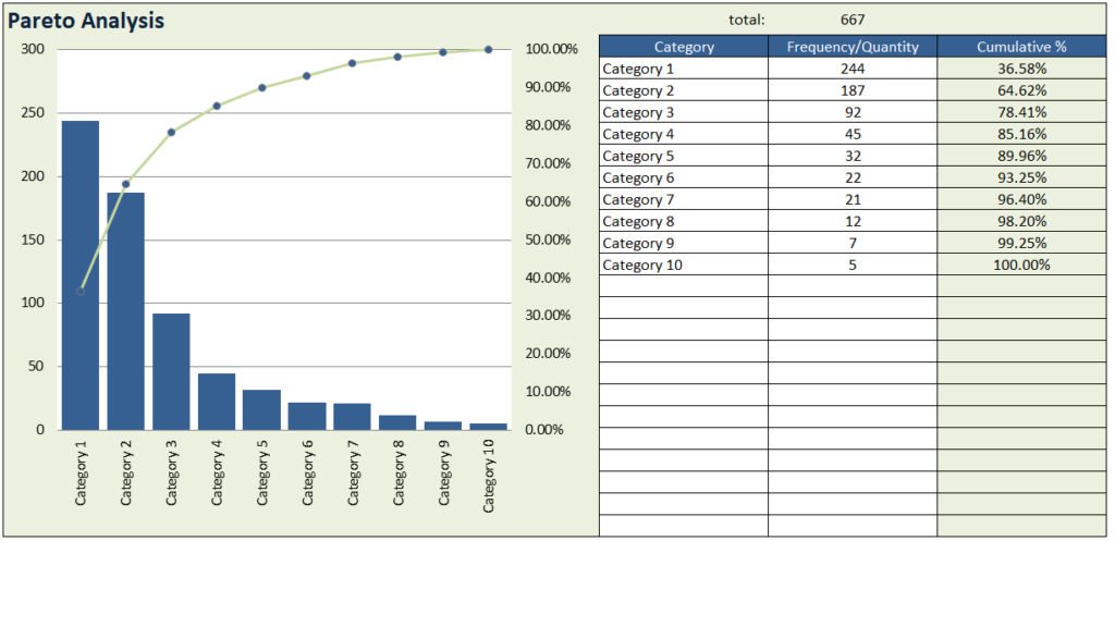
Excel Pareto Chart Sample
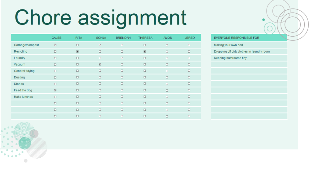
Core Assignment Chart Excel Template
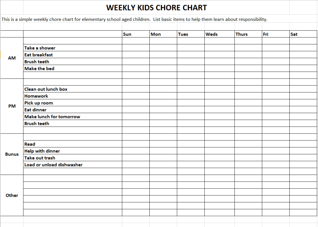
Weekly Kids Chore Chart Template in MS EXCEL
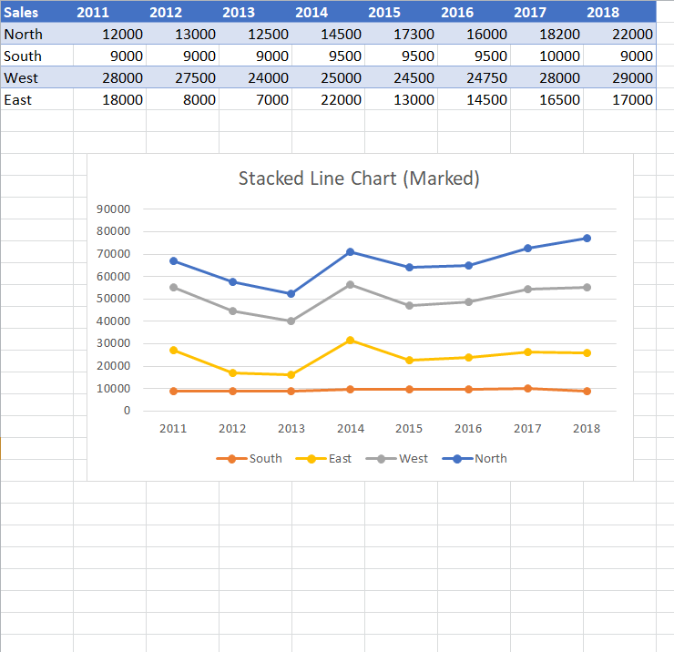
Excel Line Chart Example
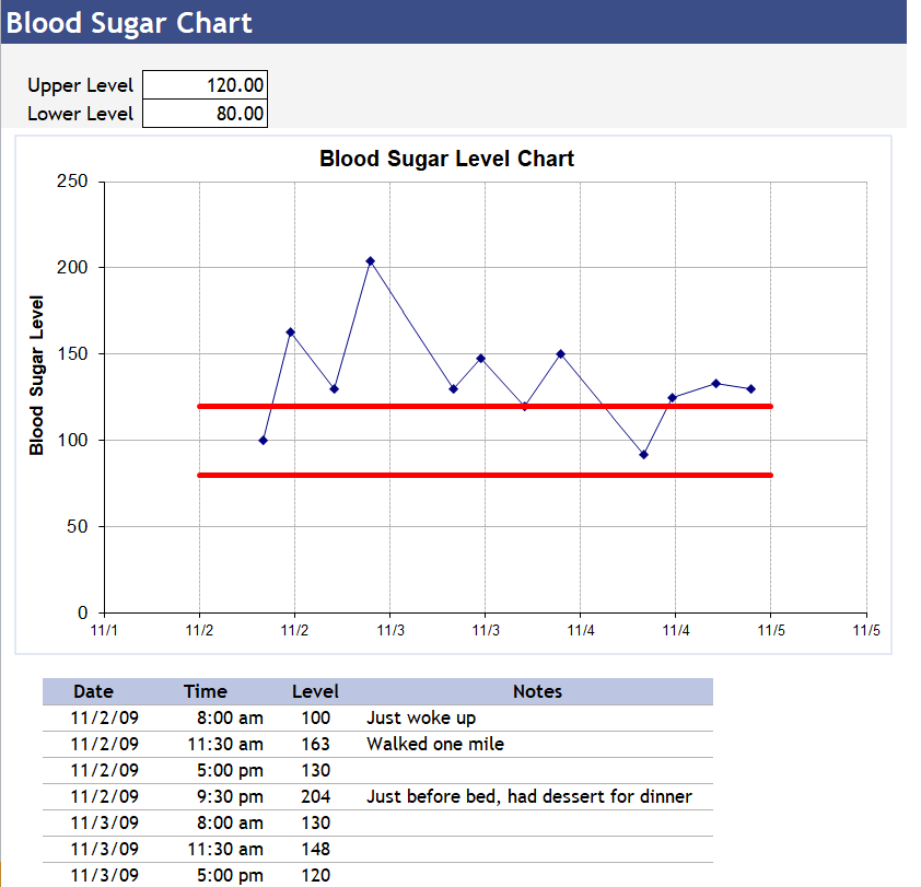
Free Editable Blood Sugar Level Chart Template
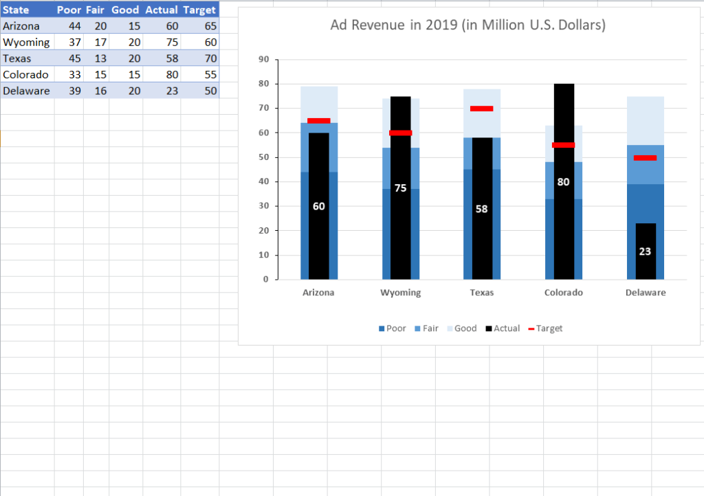
Excel Chart Example of Ad Revenue
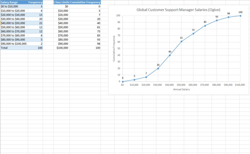
Official Excel Chart Template
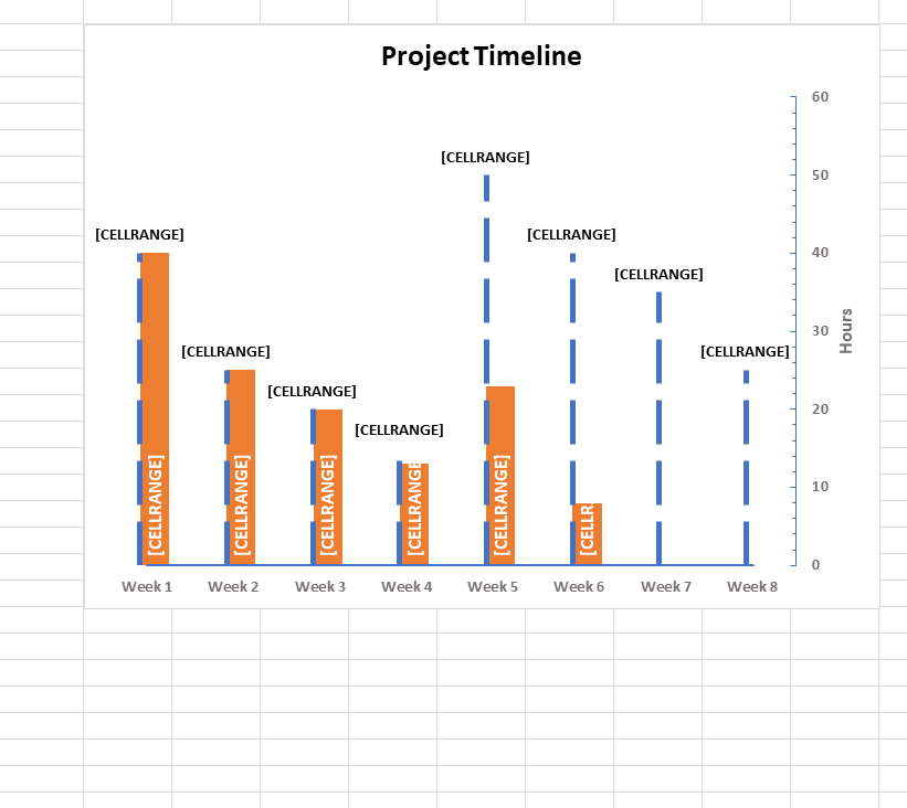
Project Timeline Chart Example
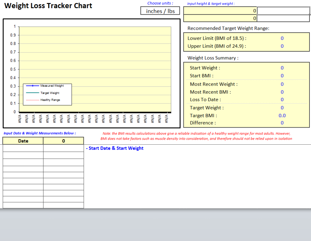
Weight Loss Tracker Chart Template
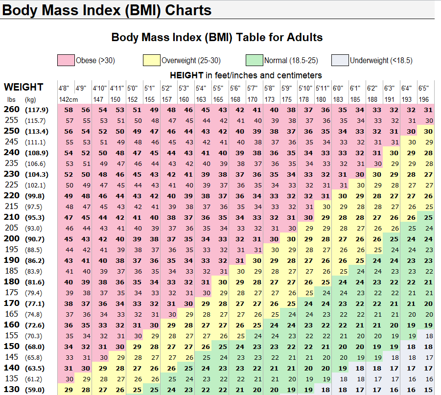
Sample Excel Chart for Body Mass Index (BMI)
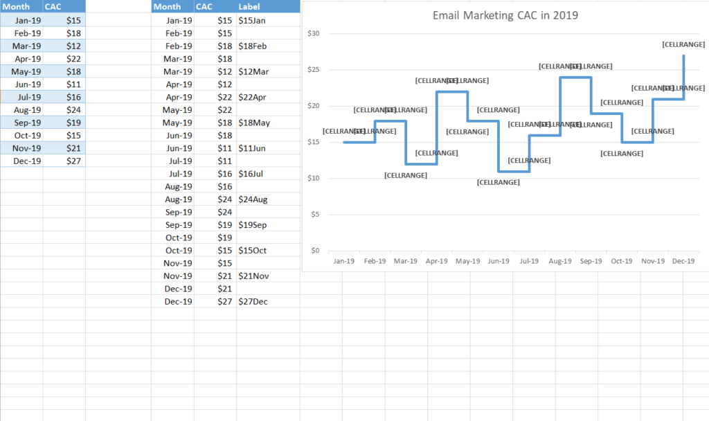
Email Marketing Trends Chart Template in MS EXCEL
Tips for Charts People Understand
One message per chart. If you need to explain two things, make two charts.
Label everything. Add a clear title, axis labels and units, such as “Monthly sales (USD).”
Go easy on color. Use one highlight color for the data point that matters and keep the rest neutral.
Skip 3D effects. They make values harder to read accurately.
Charts drop neatly into our monthly report templates for presenting results, and an Excel inventory list gives you ready data to chart stock levels. Pareto charts are a natural next step after a root cause analysis, and project charts work great with a business action plan.
Frequently Asked Questions
How do I change the data in a chart template?
Type your numbers into the table beside the chart. The chart updates automatically. To include more rows, right-click the chart, choose Select Data and extend the range.
Do these templates work in Google Sheets?
Most do. Upload the XLSX file to Google Drive and open it with Sheets. Some formatting may look slightly different.
What is a Pareto chart used for?
It ranks causes from most to least frequent, with a cumulative percentage line, so you can see which few issues cause most of the problems.
Can I save a chart as my own template in Excel?
Yes. Right-click the finished chart, choose Save as Template, and it will appear under Templates when you insert a new chart.

You must be logged in to post a comment.