

A school logo carries more weight than most brand marks. It appears on uniforms, report cards, certificates, letters home, sports kits and the sign at the gate. For pupils it becomes part of their identity; for parents it signals values and standards; for the wider community it is a badge of local pride. Getting it right matters, whether you are founding a new school, merging two institutions or refreshing an old crest that no longer reproduces well.
Define the symbols and practical uses of a school crest or modern school logo. This guide includes one free original editable Excel worksheet, with a preview and a direct download below.
Free Editable Excel Worksheet
School Logo Design Brief
Define the symbols and practical uses of a school crest or modern school logo. This original Template Swift planning worksheet includes editable fields and an example row you can replace with your own details.

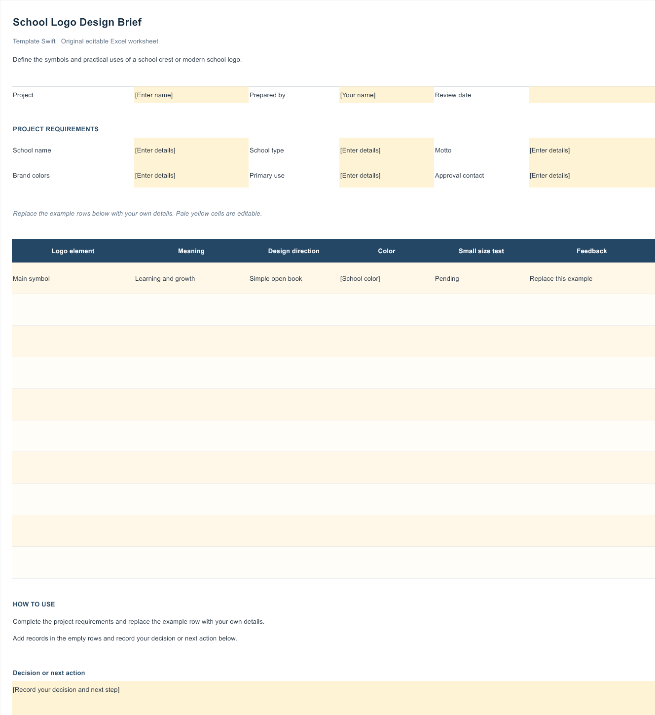
Download School Logo Design Brief (.xlsx)
Open the file in Microsoft Excel or a compatible spreadsheet application. Replace the example row, complete the highlighted input fields, and save your own copy.
Traditional Crest or Modern Mark?
Most school logos fall somewhere between two styles. Traditional crests use shields, scrolls, Latin or local-language mottos and symbolic elements such as books, torches, towers or animals. They convey history, stability and academic seriousness, which suits long-established schools and those with a strong sense of heritage. Their weakness is complexity: fine details often blur when printed small or embroidered.
Modern marks use simpler shapes, fewer colours and clean typography. A single stylised owl, an open book formed from two curves, or the school’s initials in a distinctive arrangement can feel fresh, friendly and forward-looking. These work especially well for primary schools, academies, tutoring centres and online learning providers, and they reproduce cleanly on screens and small items.
Many schools now use a hybrid: a simplified version of a traditional crest, keeping its key symbol and colours but removing clutter. This respects tradition while making the logo far more practical.
Logos for Different Kinds of Schools
Nurseries and primary schools usually benefit from warm, friendly logos with rounded shapes, cheerful colours and simple illustrations that young children can recognise and even draw themselves. A smiling sun, a tree full of leaves or a simple animal mascot works well. Avoid overly formal crests that can feel distant to families with very young children.
Secondary schools and colleges often aim for a more grown-up identity that teenagers are happy to wear. Clean shields, confident typography and a restrained palette can feel both traditional and modern. House colours and sports team badges can sit alongside the main logo as a family of related marks.
Tutoring centres, language schools and training academies are businesses as well as educators, so their logos behave more like commercial brands. They need to look professional on websites, social media ads and printed flyers, and they often favour modern wordmarks with a small icon, much like the approaches in our gym and fitness logo collection.
Special schools and alternative education settings may want a logo that emphasises care, inclusion and individual growth. Soft shapes, open forms and accessible, highly readable typography help communicate a welcoming environment.
Choosing Symbols With Meaning
The best school logos tell a small story. Start by listing what makes your school distinctive: its location, its founding story, its values, a local landmark, or a subject it is known for. Then look for a symbol that captures one of those ideas simply.
Common education symbols each carry a familiar meaning. An open book suggests learning and knowledge, a torch or lamp represents enlightenment, an owl stands for wisdom, a tree implies growth and roots in the community, and a star or rising sun suggests aspiration. These are popular for good reason, but combining a classic symbol with something local, such as a tree drawn in the shape of a species found near the school, makes the logo more personal and memorable.
Animals are often chosen for sports teams and house systems, and they can work well in the main logo too, especially for younger pupils who enjoy a mascot. Keep the drawing simple and friendly rather than aggressive, and make sure it can be reduced to a single colour for embroidery.
Colours and Mottos
School colours tend to last for generations, appearing on uniforms, sports kits and buildings, so choose them carefully. Two main colours plus a neutral are usually enough. Deep blues, greens, burgundies and golds feel established and calm, while brighter combinations suit primary schools and creative academies. Check that your colours have enough contrast to remain readable for people with colour vision differences, and that they are practical for uniform suppliers to match.
A motto can add character, but keep it short. Two to five words are easier to remember and fit more comfortably in a logo. If you use a Latin or other classical motto, be sure the translation is accurate; it is worth asking a specialist to check. Many schools now prefer a plain-language motto that pupils can easily understand and repeat.
Making the Logo Work Everywhere
A school logo is reproduced in more ways than almost any other brand. Before approving a design, test it in each of these situations:
- Embroidery on blazers, jumpers and caps, where tiny text and thin lines disappear.
- Single-colour printing on letters, photocopied worksheets and forms.
- Small sizes on student and staff ID cards, badges and website icons.
- Large sizes on signs, banners and sports hall walls.
- Official documents such as report cards and certificates of attendance.
- Digital channels including the website, learning platforms, emails and social media.
Ask your designer to supply a full-colour master, a one-colour version, a white version for dark backgrounds and a simplified badge for very small uses. Store the vector files safely and share them with uniform suppliers and printers so the logo is always reproduced consistently.
Involving Your School Community
A new or refreshed logo is more likely to be embraced if people feel involved. Consider running a short survey asking pupils, parents, staff and alumni which values and symbols they associate with the school. Some schools invite pupils to submit drawings, then have a professional designer refine the strongest ideas into a polished logo. This creates a sense of ownership without compromising quality.
When the final design is ready, introduce it with a clear explanation of what it represents. A feature in the school newsletter, an assembly presentation and an updated letterhead help the new identity settle in quickly. If uniforms are changing, give families plenty of notice and allow a transition period so no one has to replace items that are still in good condition.
Frequently Asked Questions
Can I use one of these logos for my school?
Not the logos of real schools, which belong to those institutions. Marketplace and free vector designs may be usable depending on their licence, but an original logo is the best choice for a school’s long-term identity.
Should a school logo include the full school name?
Usually yes, in the main version. Also create a compact badge or monogram without the full name for small uses such as embroidery on ties or app icons.
How many colours should a school logo have?
Two or three is ideal. Fewer colours make embroidery and printing cheaper and keep the logo recognisable in one-colour formats.
How do I update an old crest without losing its heritage?
Keep the most recognisable symbol and colours, simplify fine details, update the typography and create clean vector artwork. This modernises the crest while preserving its history.
Who should approve a new school logo?
Usually the head teacher and governing body or board, after consultation with staff, pupils and parents. Check any trust, district or diocesan guidelines that apply to your school.

