

Online dating is built on trust. Before anyone shares a photo or a single detail about themselves, they want to feel that a site is genuine, safe and worth their time. The landing page is where that judgement happens, often within a few seconds of arriving from an ad, a search result or a friend’s link.
This page brings together dating landing page templates and design examples to help you plan a sign-up page for a dating service, matchmaking agency, singles event or community site. After the gallery, you will find guidance on the elements that make visitors comfortable signing up, the safety and privacy features people now expect, and the design mistakes that make a dating site look untrustworthy.
What a Dating Landing Page Needs to Do
A landing page differs from a home page. It has a single goal, usually to get a visitor to create a free account or join a waiting list, and everything on it should support that goal. For a dating service, that means answering three questions quickly: who is this site for, why is it different, and is it safe?
Start with a clear headline describing your audience, such as “Meet local singles who love the outdoors” or “Matchmaking for busy professionals over 40”. A specific niche is easier to trust and remember than a vague promise to find everyone their soulmate. Follow it with a short explanation of how your service works, ideally in three simple steps, and a prominent sign-up form or button. Keep the form short; asking for an email address and password first, then collecting profile details later, usually feels less intrusive.
Responsible use: Dating services handle personal and often sensitive information, so they carry real responsibilities. Restrict sign-ups to adults and use appropriate age checks, follow data protection and privacy laws in every country you serve, and be transparent about pricing and subscriptions. Never use fake profiles, stock photos presented as real members or invented success stories. Provide clear reporting tools and safety advice for meeting in person. About the links below: these designs come from blogs, roundups and theme sites rather than us. Four original pages are no longer available and those links have been removed; some remaining links lead to article roundups or paid themes rather than direct downloads.
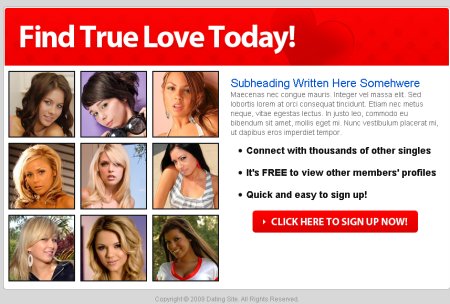
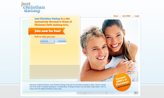
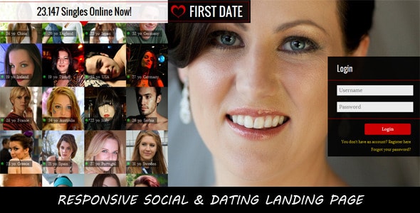
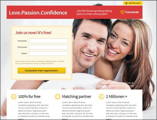
Dating Landing Page Designs







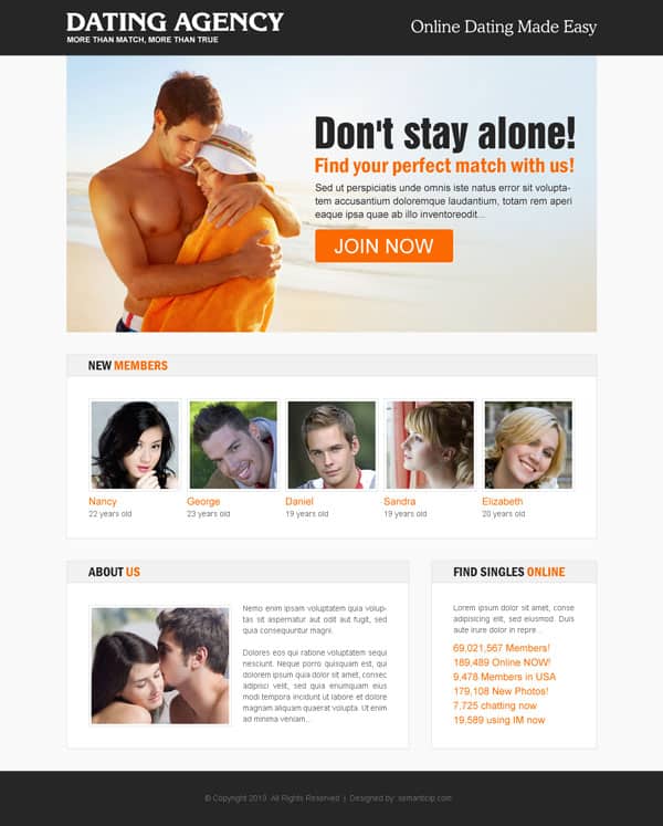



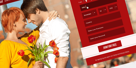

Building Trust on the First Screen
Visitors to a dating site are cautious, and for good reason. Many have heard stories of fake profiles, hidden subscription charges or data leaks. Your landing page can reassure them without long blocks of text. Show real, recognisable signals of trust: a short explanation of how profiles are verified, a visible link to your privacy policy, and plain information about what is free and what costs money.
Photos matter a great deal. Use images that reflect your actual audience in age, background and style. If you use stock photography, avoid presenting models as members, and choose natural, friendly images over overly glamorous ones, which can feel unrealistic. Genuine testimonials from real couples, shared with their permission, are powerful, but only use them if they are true.
Design choices also signal quality. Clean layouts, consistent fonts, good spelling and a secure HTTPS connection all help. Pop-ups, flashing banners and aggressive countdown timers do the opposite and make visitors wonder what else might be hidden.
Safety and Privacy Features to Highlight
People increasingly choose dating services based on how safe they feel. If your platform offers these features, mention them on the landing page:
- Profile verification, such as photo checks or confirmed email and phone numbers.
- Blocking and reporting tools that are easy to find and use.
- Privacy controls letting members decide who sees their photos, location and details.
- Moderation by real people who review reports and remove abusive accounts.
- Safety advice for meeting in person, such as choosing public places and telling a friend.
- Clear data practices, including how members can download or delete their information.
Highlighting these features is not just good marketing; many of them are expected or required by law in different regions, so they should be built in from the start rather than added later.
Writing Copy That Feels Human
Dating is personal, so the words on your landing page should sound like a real person talking, not a sales script. Avoid exaggerated promises such as “guaranteed love in 30 days”. They raise suspicion and set expectations no service can meet. Instead, describe what members can actually do: browse profiles of people nearby, join themed events, or get introductions from a human matchmaker.
Be inclusive and specific about who is welcome. If your service is for a particular community, such as people of a certain age group, faith, profession or interest, say so warmly and clearly. If it is open to everyone, make sure the images and wording reflect that. Short sentences, friendly verbs and a touch of humour usually work better than formal language.
Explain pricing in plain terms. If there is a free tier, list what it includes. If subscriptions renew automatically, say so near the sign-up button rather than hiding it in the terms. Clear pricing reduces complaints and refund requests, and it builds the kind of goodwill that leads to recommendations.
Finally, give a human point of contact. A visible support email, a short “about us” line naming the team or company behind the service, and a physical business address where appropriate all help visitors feel that real, accountable people run the site.
Designing for Mobile First
Most people browse dating services on their phones, often in short bursts. Design your landing page for a small screen first, then expand it for desktops. Keep the headline short enough to fit on two lines, place the sign-up button where a thumb can reach it, and make form fields large and easy to tap. Test loading speed on a mobile connection, because a slow page loses visitors before they even see your offer.
If you also offer an app, make it easy to find with clear download buttons, but do not force visitors to install it before they understand what you offer. Many people prefer to explore on the web first.
Measuring and Improving Your Page
Once the page is live, track how many visitors start the sign-up process and how many finish it. If many people leave at the form, try asking for fewer details. If few people click the main button, test a clearer headline or a different image. Change one element at a time so you know what made the difference.
Search visibility matters too, especially for niche or local dating services. The same principles that apply to blogs, covered in our guide to SEO friendly blog templates, apply here: fast pages, clean headings and genuinely useful content. A simple marketing plan helps you decide where to spend time and budget, whether on search, social media or community events.
Related Website Templates
If you are building a broader community platform, you may find ideas in our other collections. Chat app templates show how messaging screens can be laid out clearly, directory website templates demonstrate search and filtering, and dynamic website templates cover the kind of flexible layouts that member-driven sites need.
Frequently Asked Questions
What is the most important element on a dating landing page?
A clear headline explaining who the service is for, followed by a simple sign-up form. Trust signals such as verification and privacy information come a close second.
Can I use stock photos on a dating site?
You can use licensed stock images for decoration, but never present models as real members or couples. Misleading imagery damages trust and may break advertising rules.
Do I need age verification?
Dating services should be for adults only. Requirements vary by country, so check local laws and use age checks appropriate to your platform.
How long should a dating landing page be?
Keep the essentials on the first screen, then add supporting sections below for those who want more detail, such as how it works, safety features and pricing.
Are these templates free?
Some links lead to free resources or articles, while others go to paid themes. Several original pages are no longer available. Check each source for price and licence terms.

