

Typography quietly shapes how a phone or an app feels. Swap a stiff default typeface for something friendlier and the same screen suddenly feels more personal; choose the wrong one and even a great app looks cheap. These free Android fonts and font resources cover both sides of that coin: stylish typefaces for app designers and developers, plus tips for people who simply want their phone to look a little more like them.
Below you’ll find nine font picks and font resource pages, from tech-inspired display faces to bold headline fonts and collections of free fonts. Before the gallery we’ll explain how fonts work on Android and what to check in a license; after it, you’ll find pairing ideas, install tips and common mistakes to avoid.
Two Very Different Reasons to Look for Android Fonts
1. You’re designing or building an app
App designers choose fonts for headings, body text, buttons and branding. The priorities here are readability on small screens, a good range of weights, support for the languages you need, and a license that allows embedding the font in an app.
2. You want to personalize your phone
Many people simply want a different look for their home screen, messages and menus. Some phone makers include font options in the display settings, some launchers and theme apps offer font packs, and a few devices restrict changes entirely. What’s possible depends heavily on your phone’s brand and software version.
How Fonts Work on Android
Android’s long-standing default typeface family is Roboto, a clean sans-serif designed for screens. Apps can bundle their own fonts or load fonts from online font libraries, and many open-source font families are available under licenses such as the SIL Open Font License, which generally allows use in apps and commercial projects.
| Font file type | What it is | Notes for Android |
|---|---|---|
| TTF (TrueType) | The most common font format | Widely supported in apps and design tools |
| OTF (OpenType) | Modern format with advanced typographic features | Supported in apps; great for ligatures and alternates |
| Variable fonts | One file containing many weights and widths | Saves space in apps when supported |
Licenses matter more than you think
“Free” fonts aren’t always free for every use. Some are free for personal projects only, some require a paid license for apps or logos, and some ask for attribution. Before you ship an app or print a product, read the license file that comes with the font or the terms on the download page.
What makes a font work well on a phone?
- Open letter shapes that stay readable at small sizes.
- Clear differences between similar characters like I, l and 1, or O and 0.
- Several weights (light, regular, bold) for hierarchy without switching fonts.
- Good spacing so words don’t feel cramped on narrow screens.
- Language support for accented letters or other scripts your users need.
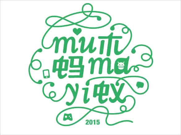
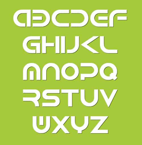
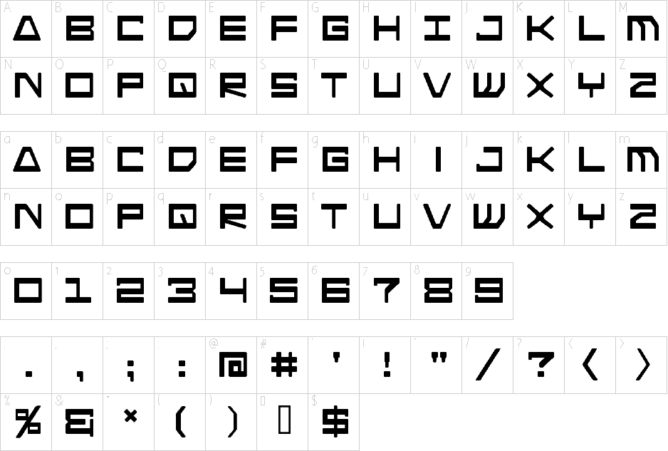
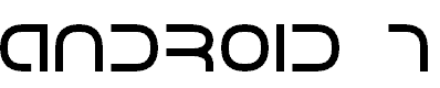
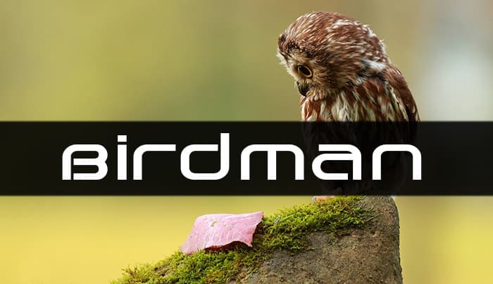
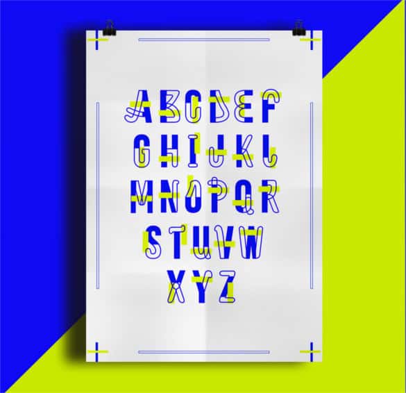
About the downloads: The buttons link to font sites, design communities and articles. Some go straight to a font download, some to a collection page, and one is an article about font-changing apps. Two original pages are no longer available. Check each font’s license on the source page, and only install apps or font files from sources you trust.
9 Free Android Fonts and Font Resources










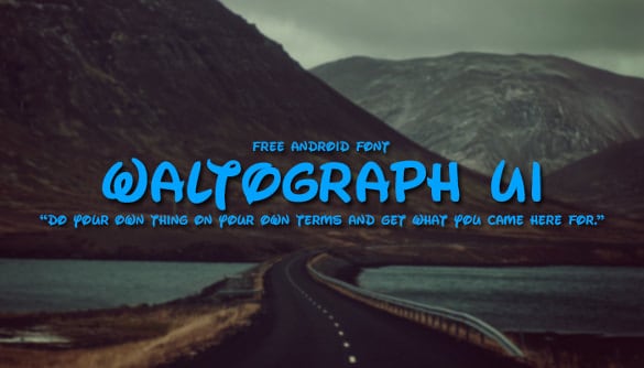

Using Custom Fonts in an Android App
If you’re a designer handing off to developers, or a developer adding fonts yourself, a tidy process saves headaches later:
- Pick a primary family with at least regular, medium and bold weights for body text and headings.
- Optionally add one display font for logos or big titles. More than two families usually looks messy.
- Confirm the license allows embedding in apps and covers the number of downloads you expect.
- Add the font files to the project’s font resources or load them from an online font library, following current Android developer documentation.
- Define a type scale (for example headline, title, body and caption sizes) and reuse it everywhere.
- Test with accessibility settings. Increase the system font size and check that text wraps instead of being cut off.
Easy pairing ideas
| Headline style | Body text pairing | Mood |
|---|---|---|
| Bold geometric sans | Neutral humanist sans | Modern, techy |
| Condensed all-caps display | Regular sans-serif | Sporty, energetic |
| Elegant serif | Clean sans-serif | Premium, editorial |
| Rounded sans | Same family, lighter weight | Friendly, playful |
Don’t forget numbers, icons and other languages
Fonts are often chosen by looking at a sample headline, but apps display far more than words. If your app shows prices, times, scores or dashboards, check how the font’s numerals look. Tabular (fixed-width) numbers keep columns of figures neatly aligned, which matters in banking, fitness and delivery apps. Make sure currency symbols, percent signs and arrows are included and look consistent with the letters.
If your audience speaks more than one language, test the font with real text in each one. Many decorative display fonts include only basic Latin letters, so accented characters may fall back to a different font and look out of place. For icons, use a dedicated icon set rather than mixing icon glyphs from different fonts, so line weights and corner styles stay consistent throughout the interface.
Finally, look at your font in dark mode. Thin weights that look elegant on a white background can appear to glow or blur on dark screens, so you may need a slightly heavier weight for body text in your dark theme.
Changing the Font on Your Own Phone
If you just want a fresh look, start with the safest options first:
- Check Settings first. Look under Display or Font and style. Some manufacturers include several built-in fonts and let you download more from their official theme store.
- Try a launcher or theme app from the official app store. These often change fonts on the home screen and app drawer, though not always in every app.
- Adjust size and boldness. Even without new fonts, increasing size or turning on bold text can make a big difference in readability.
- Avoid risky workarounds. Rooting a phone or installing font files from unknown websites can void warranties, break updates and create security risks.
Example: A small bakery building its first ordering app chose one rounded sans-serif family for everything: bold for prices and buttons, regular for menu descriptions. Its logo used a hand-lettered display font only on the splash screen. The result felt warm and on-brand, loaded quickly, and stayed readable for older customers who used larger text settings.
Common Font Mistakes in Mobile Design
- Using a decorative script for body text, which becomes unreadable at small sizes.
- Mixing three or more font families on one screen.
- Setting light gray text on white backgrounds.
- Ignoring how text grows when users enlarge system font size.
- Shipping fonts without checking the license for app embedding.
Related Templates for App and Brand Projects
Fonts are one piece of a larger design system. If you’re designing a messaging feature, see our roundup of chat app templates. Maintaining an older mobile web app? These jQuery mobile templates explain when legacy frameworks still fit. Carry your new typography into everyday business communication with matching email signature templates and letterhead templates, and show off your font choices in a creative infographic resume.
Frequently Asked Questions
Are these Android fonts free for commercial use?
Not always. Some are free for personal use only. Check the license on each download page before using a font in an app, logo or product.
Can I install a new font on any Android phone?
It depends on the manufacturer and software version. Some phones offer built-in font options; others limit changes to launchers and theme apps.
What is the default Android font?
Roboto has long been Android’s default font family, though phone makers often ship their own system fonts.
How many fonts should an app use?
Usually one or two families. Use different weights and sizes of the same family to create hierarchy.
Is it safe to download fonts from any website?
Stick to reputable font libraries and the creator’s own pages. Avoid unknown sites that bundle fonts with installers or ask for unusual permissions.

